This is my data analytics practice by analyzing Klay Thompson’s performance so far in the 2018-2019 season up to 22nd Dec 2018. Klay Thompson is the shooting guard of Golden State Warriors. He is a three time world champion and I am a big fan of his playing style and deadly explosiveness. This post features my findings by analyzing his shot data this season from NBA website here. My code is available on my personal GitHub for your reference.
Findings
- Klay made about 44% of his shots so far

- Klay’s successful shots’ average distance to the basket is 15.92m
- He made more shots in the first half than he did in the second half
- 67% of Klay’s made shots are two pointers. The rest are three pointers

- Living up to his name, Klay’s favorite play type is “catch and shoot jump shot”

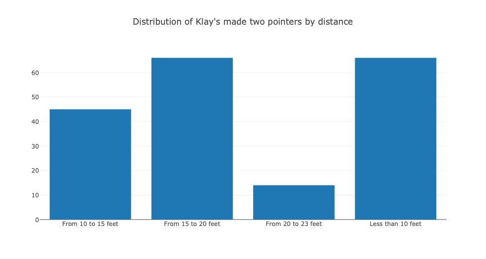
- Regarding Klay’s made two-pointers, below is the distribution by distance. He seems to be more effective within 10 feet of the basket and from 15 to 20 feet.
- In regards to Klay’s three pointers, the distribution by distance to the basket is as follows: (no surprise that the farther he is from the basket, the less lethal he is)

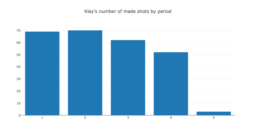
- As one of the best three point shooters in the league, Klay seems to be equally good throughout the periods of a game, except for the first quarter

Technical lessons I learned from this practice:Pie chart in Python with Matplot
Pie chart in Python
Let’s say you have two variables: TwoPT and ThreePT that stand for the shooting percentage of Klay’s two and three pointers respectively. Here is the code to draw a pie chart
labels = '2PT Field Goal', '3PT Field Goal'
sizes = [TwoPT, ThreePT]
colors = ['green', 'gold']
explode = (0, 0)  # explode 1st slice

# Plot
plt.pie(sizes, explode=explode, labels=labels, colors=colors,
        autopct='%1.1f%%', shadow=True, startangle=140)

plt.axis('equal')
plt.title("Klay's made shots by shot types")
plt.show()
Nunique function
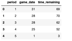
Imagine if you have a data frame as the following

If you want to count how many events (whether it’s a missed or made shot) by Klay by period, instead of using SQL, the alternative is to use Nunique function. An advantage of using the aggregate is that the outcome is automatically a data frame. The code is as follows:
periodstats = madeshot.groupby(by='period', as_index=False).agg({"game_date": pd.Series.nunique, 'time_remaining': pd.Series.nunique}) #the data frame's name is madeshot. Pd is the abbreviation of PandasThe result is:
Sort and get the top 10 of a data frame
If your data frame looks like the one below and your intention is to get the top 10 records in terms of “times”, what will you do?

The code I used is pretty straightforward and simple. (The data frame’s name is shotdistance
shotdistance = shotdistance.sort_values(by='times', ascending=False)
shotdistance_top10 = shotdistance.head(10)
Categorize a data frame by bins
If you want to categorize Klay’s shot by distance in terms of “less than 10 feet”, “from 10 to 15 feet” and “from 15 to 20 feet”, for instance, what will you do? The code to turn the distance to categories is:
df1 = pd.cut(TwoPTtype['shot_distance'], bins=[0, 10, 15, 20, 23], include_lowest=True, labels=['Less than 10 feet', 'From 10 to 15 feet', 'From 15 to 20 feet', 'From 20 to 23 feet'])

#pd stands for Pandas
#TwoPTtype is the name of the data frame in question
The result is:

If you merge that data frame with the frequencies in the original data frame:
df1 = pd.cut(TwoPTtype['shot_distance'], bins=[0, 10, 15, 20, 23], include_lowest=True, labels=['Less than 10 feet', 'From 10 to 15 feet', 'From 15 to 20 feet', 'From 20 to 23 feet'])

newdf = pd.concat([df1, TwoPTtype['times']], axis=1)

Leave a comment