Sometimes we run into designs or features that are either a pleasant surprise or leave us with some degree of annoyance, wishing that they could be better. Below are a few I came across today
Bad – Twitter Mobile App
I was strolling down my Twitter app this afternoon and ran into a tweet that was marked sensitive. When I clicked on the message, I was redirected to the web version of Twitter and prompted to enter my credentials to change safety settings. I wonder why that has to be the case. If that’s my phone and Twitter account, why can’t it take place within the app?

Bad – iMessage Search Function
Great at their intuitive design as they may be, Apple still has one feature that annoys me very much: the search function on iMessage. Both the desktop and mobile versions are pretty terrible in this sense. If you want to search for a particular word in messages, get ready to be frustrated. The software only shows the latest message that contains the keyword. It doesn’t show the other messages that contain the keyword. Users have to search through the entire chat history manually.
Good – ASOS Return Label
On Amazon, if you want to return stuff that you bought, but don’t like, the typical process will be like this:
- Go to your order history
- Choose the goods you want to return
- Choose a reason
- Either print out the label your own or
- Save a QR code, go to a UPS store, have the store print out the label for you
- Send the goods back to Amazon
Depending on how you have your stuff delivered in the first place, you may have to print multiple labels for your returns.
On ASOS, the process is much better. In the delivered package that is pretty fast in my experience, they include a printed label already for you. All you need to do is to mark the reasons for return and paste the label on the package.

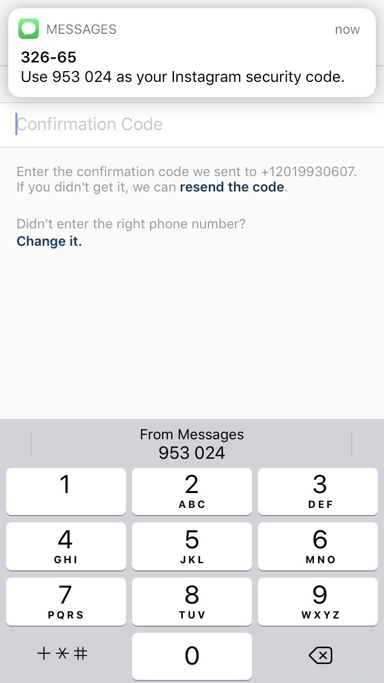
Good – Apple Verification Code
With the latest iOS, you no longer have to remember verification codes from software providers. When the code is sent to you, a small window will popup on the screen below the field that you are supposed to enter the code to. One touch on the window and the code is immediately passed to the field. No more multiple touches and remembering the code by heart momentarily.

Leave a comment