Amazon isn’t exactly known for its design capability, yet I am relatively pleased with the Kindle App on iOS 13. Below is a brief comparison between the two apps in terms of features and UX.
Appearance
The Kindle app offers different options to adjust the font, the theme, the spacing between rows, the brightness and the view.

With the exception of the ability to change spacing between rows, all the other features are very similar to what iBooks provides. Personally, I appreciate the green theme available on Kindle.

Looking up and translating words
Additionally, readers can translate, look up unknown words and learn more about them via Wikipedia inside the Kindle app handily. All readers need to do is to select the word and the features are automatically presented.


On iBooks, it’s a little bit different. After clicking on a word and choosing “Look up”, readers will be taken to a page that includes various options related to the word in question

Taking notes
It’s a little bit frustrating to take and copy notes on iOS. As the short video shows, users have to select a block of text manually again for any use.
If users want to use the copied text somewhere, iOS has a default footnote that comes with every single copy. The note itself reminds users of the title and author at hand, but it creates another step that becomes annoying if repeated.

On Kindle, taking notes is a bit easier. A whole block of text can be chosen and copied with only a touch of your fingertip. Additionally, there is no default footnote as in the case of iBooks.
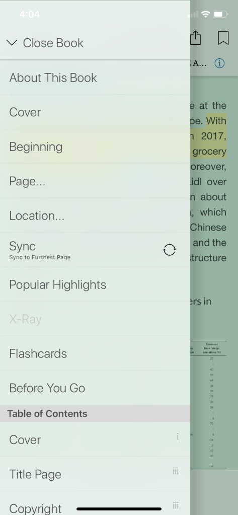
Flashcard
Kindle has one feature that is absent on iBooks: Flash Cards. It’s pretty handy for those that like to take notes and come back later to test their memory.
In short, the two apps provide very similar core functionalities. The difference comes, I suspect, mainly from special use cases. Personally, because I often copy quotes and notes from books to this blog in my book review entries, I prefer Kindle to iBooks.

Leave a comment