In this post, I’ll document how to use SQL and plotly to create a basic bar chart in Python, specifically in Jupyter Notebook. I’ll try to be as detailed and visual as possible.
The dataset I am going to use is Nike Manufacturing Map:
The first step is to click download the dataset in Excel. Once the file is downloaded, open the file and remove the first row. The first row just has the name of the file, not the columns’ names we need. Since I haven’t figured out how to remove the first row, the fast way is to do it before starting the code to make our life easier. Click save and the data is ready to go
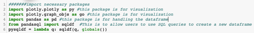
Open Jupyter Notebook. In my case, I use Anaconda. The first thing to do on a new Jupyter Notebook is to import necessary packages. The “as ABC” is to create an alias for packages with long names so that we won’t have a hard time calling those packages later in the code. Imagine having to type “plotly.graph_objs” 10 times instead of “go”.
import plotly.plotly as py #this package is for visualization
import plotly.graph_objs as go #this package is for visualization
import pandas as pd #this package is for handling the dataframe
from pandasql import sqldf #This is to allow users to use SQL queries to create a new dataframe
pysqldf = lambda q: sqldf(q, globals())
Then, load the file. To check if the file is loaded correctly, use df.head(). The command will show a snapshot of the data frame. If you want to see the whole data frame, just use df
df =pd.read_excel(‘/Users/camapcon/Documents/Github/Nike_Factory_Locations/export.xls’) #read the file in
df.head()
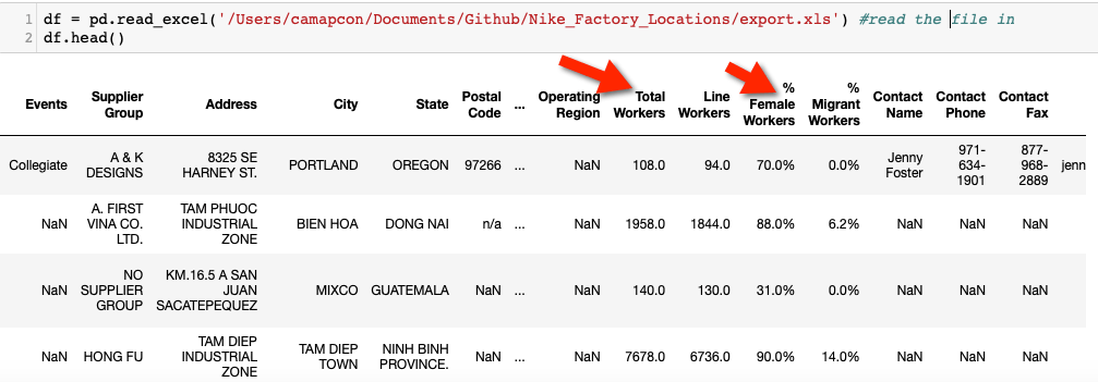
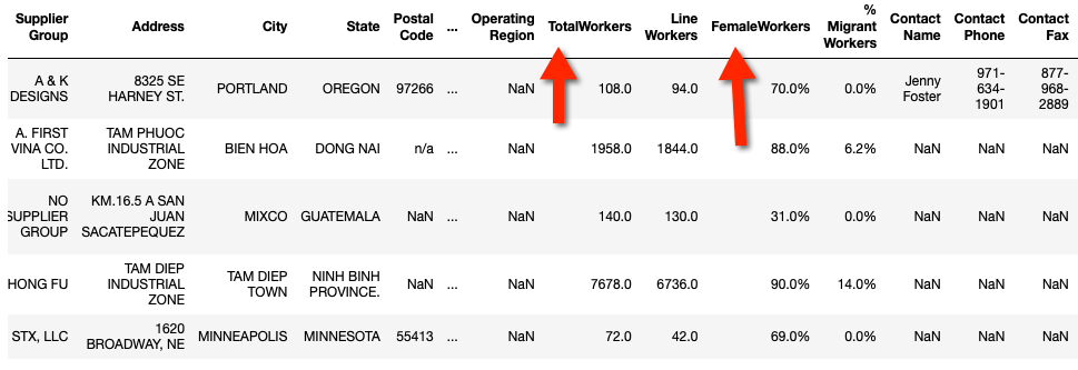
We need to change the names of the two columns highlighted in the screenshot. The way that they are named will make it tricky to process SQL queries. I tried it. It’s better to have more straightforward column names with no blank space in between. It’s pretty easy:
df = df.rename(columns={‘Nike, Inc. Brand(s)’: ‘Brands’, ‘% Female Workers’:’FemaleWorkers’, ‘Total Workers’:’TotalWorkers’})
df.head()
The next step is to use SQL to create a summary table whose data will be used to draw bar charts. What we will analyze includes:
- The total number of workers by brands
- The number of factories by brands
- Average number of workers at each factory by brands
- Average percentage of female workers at each factory by brands
The code to use SQL to create a subset is below:
Primary = “””SELECT Brands, Sum(TotalWorkers) as TotalWorkers, Count(Brands) as Count, AVG(TotalWorkers) as AvgTotalWorkers, AVG(FemaleWorkers) as FemaleWorkers From df Group By Brands””” #create a data frame using a SQL
Primary_df = pysqldf(Primary)
Primary_df
Here is the result:
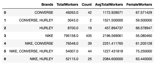
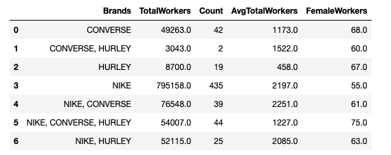
Notice that the figures aren’t pretty, right? Let’s round them up and make them look prettier
Second = “””SELECT Brands, TotalWorkers, Count, Round(AvgTotalWorkers, 0) as AvgTotalWorkers, Round(FemaleWorkers,0) as FemaleWorkers From Primary_df”””
Primary_df = pysqldf(Second)
Primary_df
Here is how it looks:
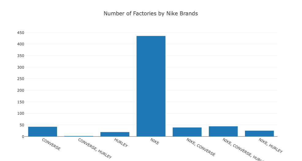
It’s time to create the bar charts:
trace1 = go.Bar( #create x and y axes
x=Primary_df[‘Brands’], #to use column Brands as the X axis
y=Primary_df[‘TotalWorkers’], #to use column TotalWorkers as the Y axis
name=’Total Global Workers by Nike Brands’
)
data1 = [trace1]
layout1 = go.Layout( #starting to plot a grouped bar chart
title=’Total Global Workers by Nike Brands’,
barmode=’group’
)fig = go.Figure(data=data1, layout=layout1)
py.iplot(fig, filename=’grouped-bar’)
Here is how it looks
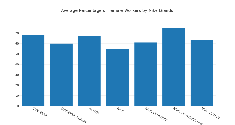
You can change the Y axis to another column as you wish. Here is an example:
trace2 = go.Bar( #Project Count by Mission Area
x=Primary_df[‘Brands’],
y=Primary_df[‘FemaleWorkers’],
name=’Average Percentage of Female Workers by Nike Brands’
)
data2 = [trace2]
layout2 = go.Layout( #starting to plot a grouped bar chart
title=’Average Percentage of Female Workers by Nike Brands’,
barmode=’group’
)fig = go.Figure(data=data2, layout=layout2)
py.iplot(fig, filename=’grouped-bar’)
Try to label different charts differently to avoid confusion and errors. It would make debugging easier as well.
That’s all I have for this post. Just some basic SQL queries and Python code to handle and visualize data with Plotly and Pandas. I still need to practice and explore more. And I urge you to do the same, if you are as inexperienced and interested in data analysis like I am.

Leave a comment