On Tuesday, Microsoft was the first big tech giant to report financial performance and they didn’t disappoint. They surpassed the market estimates on both top and bottom lines, as well as provided strong guidance. You can read an overview of the earnings call here. In this post, I’ll look at Microsoft the business through some charts that I hope will be helpful and informative to you.
Microsoft’s annualized revenue is now $185 billion at 20% growth!

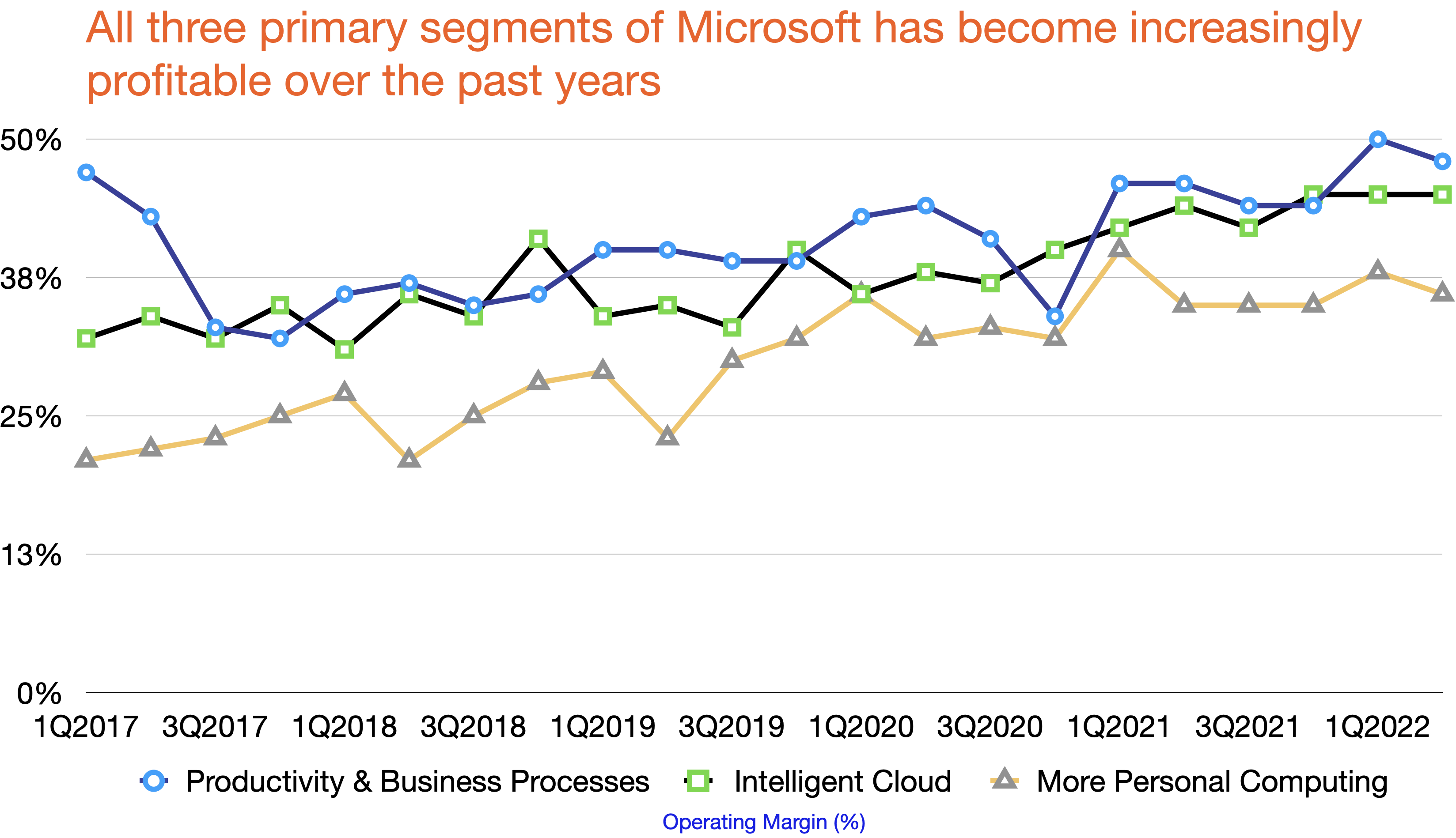
It’s highly profitable at 43% operating margin. Its annualized operating income stands at $80 billion

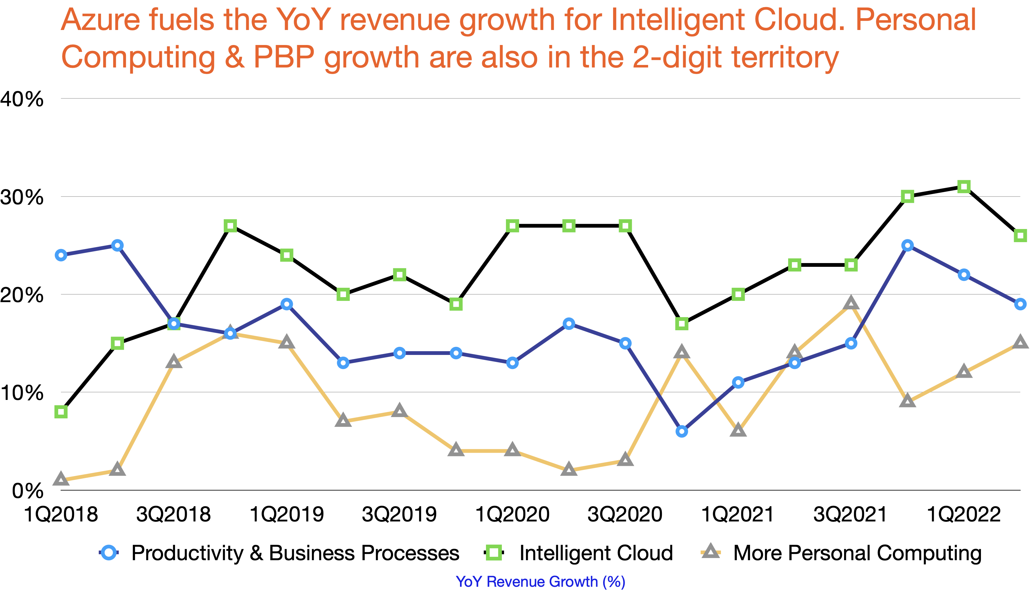
All three primary business segments have 2-digit YoY revenue growth
Azure and Cloud attract a lot of attention, but it’s Office and other productivity products that top operating margin
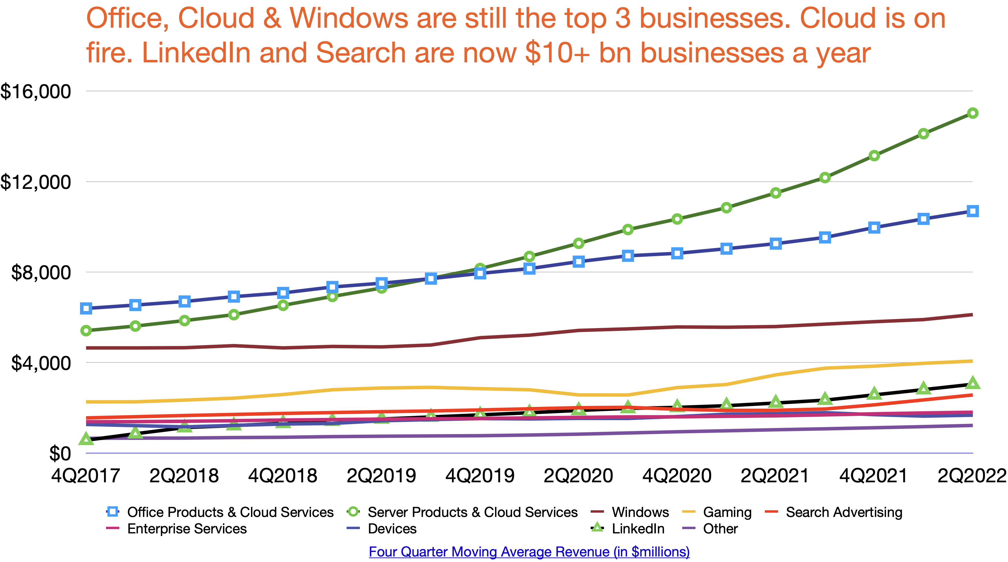
Cloud is on fire. LinkedIn & Search surpassed the $10 billion mark in annualized revenue. Gaming, the 4th largest business, now has a $20 billion run rate
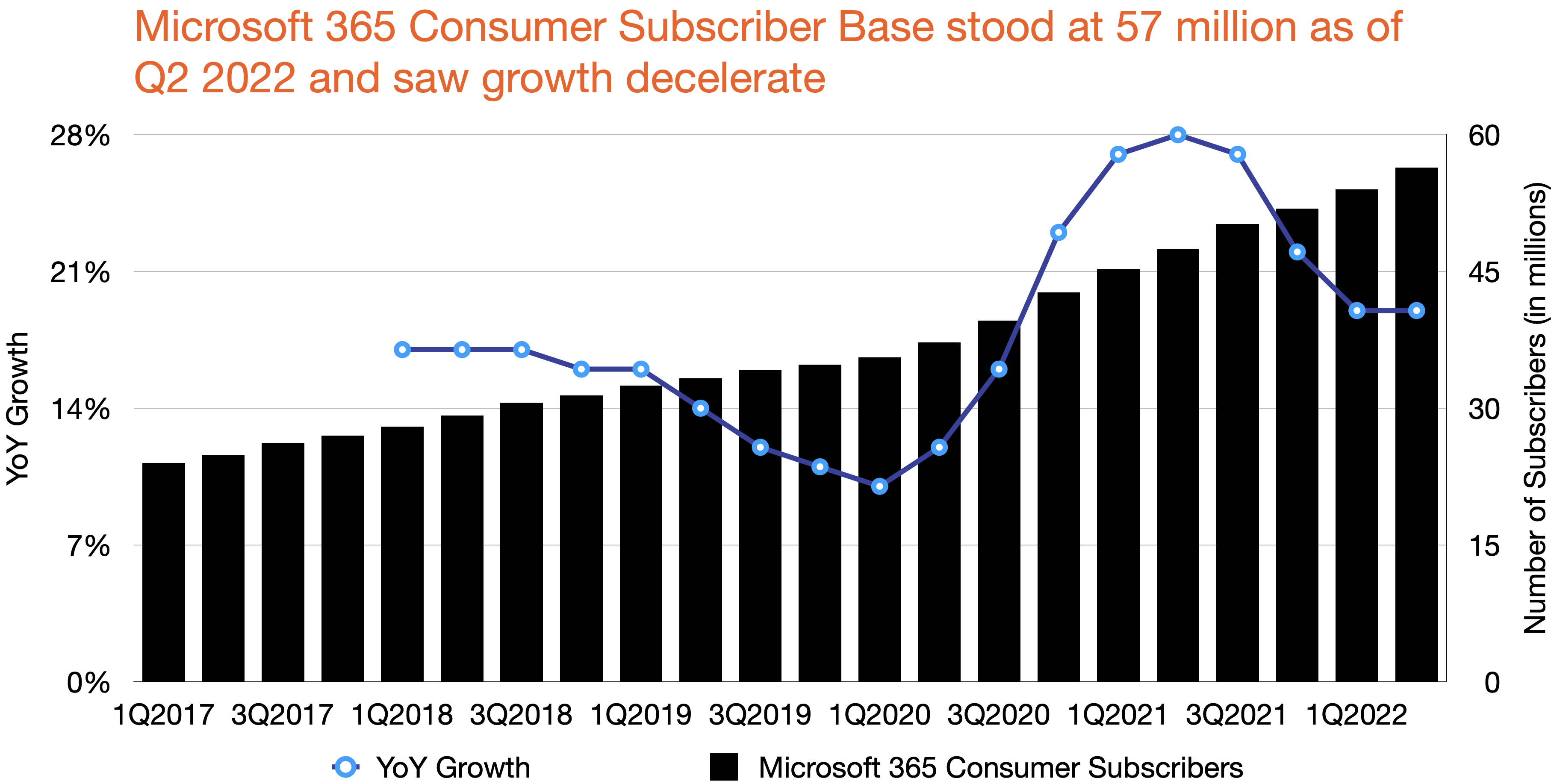
Microsoft 365 has 57 million active users though growth is slowing due to the law of big numbers
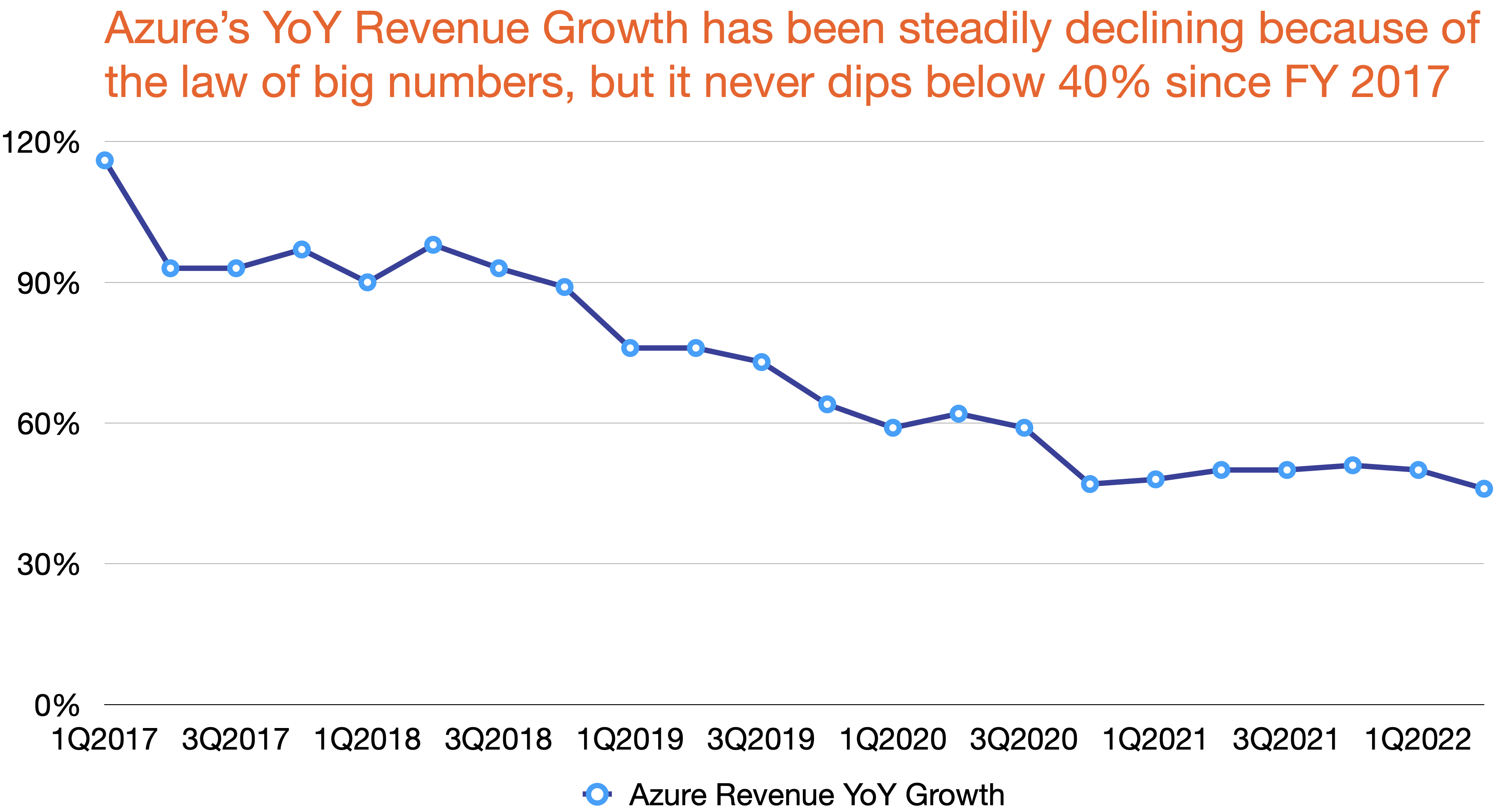
Azure’s growth is declining due to its size
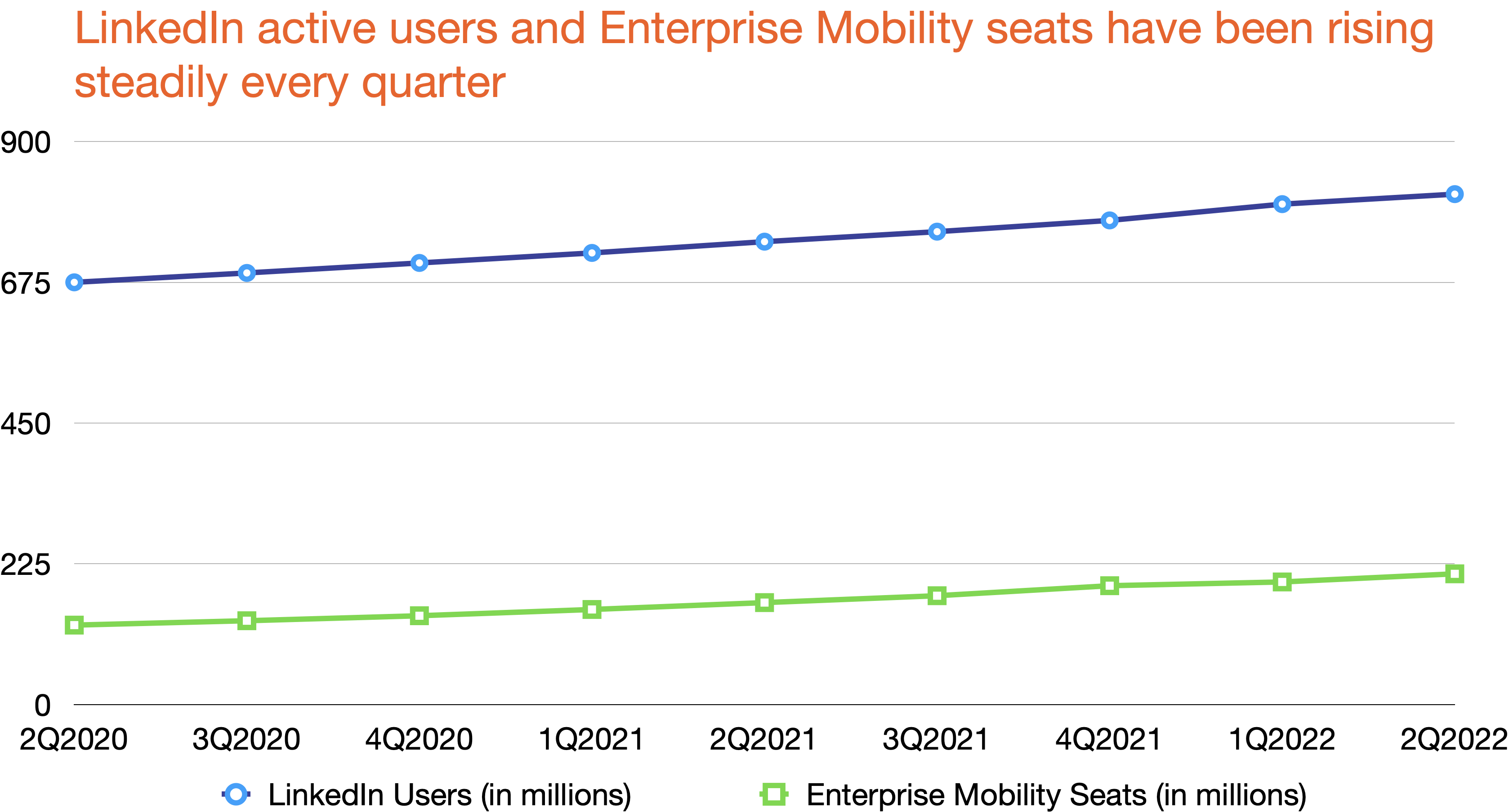
LinkedIn quietly increases its active user base every quarter. Enterprise Mobility, Microsoft’s security package, also sees consistent growth
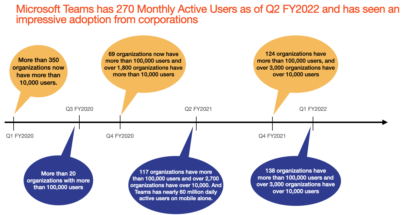
Microsoft Teams sees an increasing adoption among corporations
Disclaimer: I own Microsoft stocks in my personal portfolio

Leave a comment