Apple revealed a stunning quarter last Thursday, surprising analysts and, in my opinion, even themselves. You can listen to the earnings call and read the 10Q here. I am putting the numbers in perspective through the charts below. If you find my work useful and informative, I’ll appreciate a thumb up or a follow. Have a nice weekend!
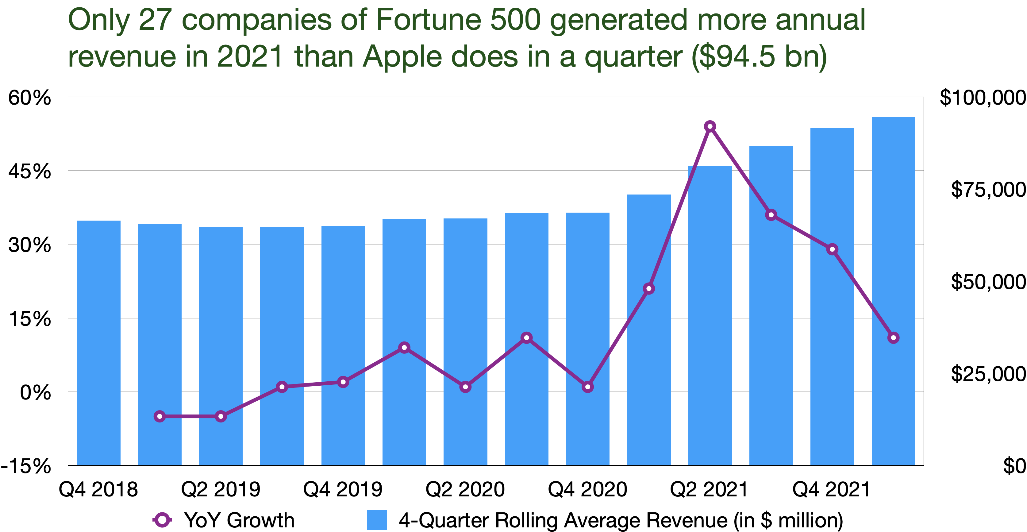
Apple had about $124 billion in Q1 FY2022. If we look at the last four quarters, it generated $94 billion a quarter, higher than most Fortune 500 companies did in 2021
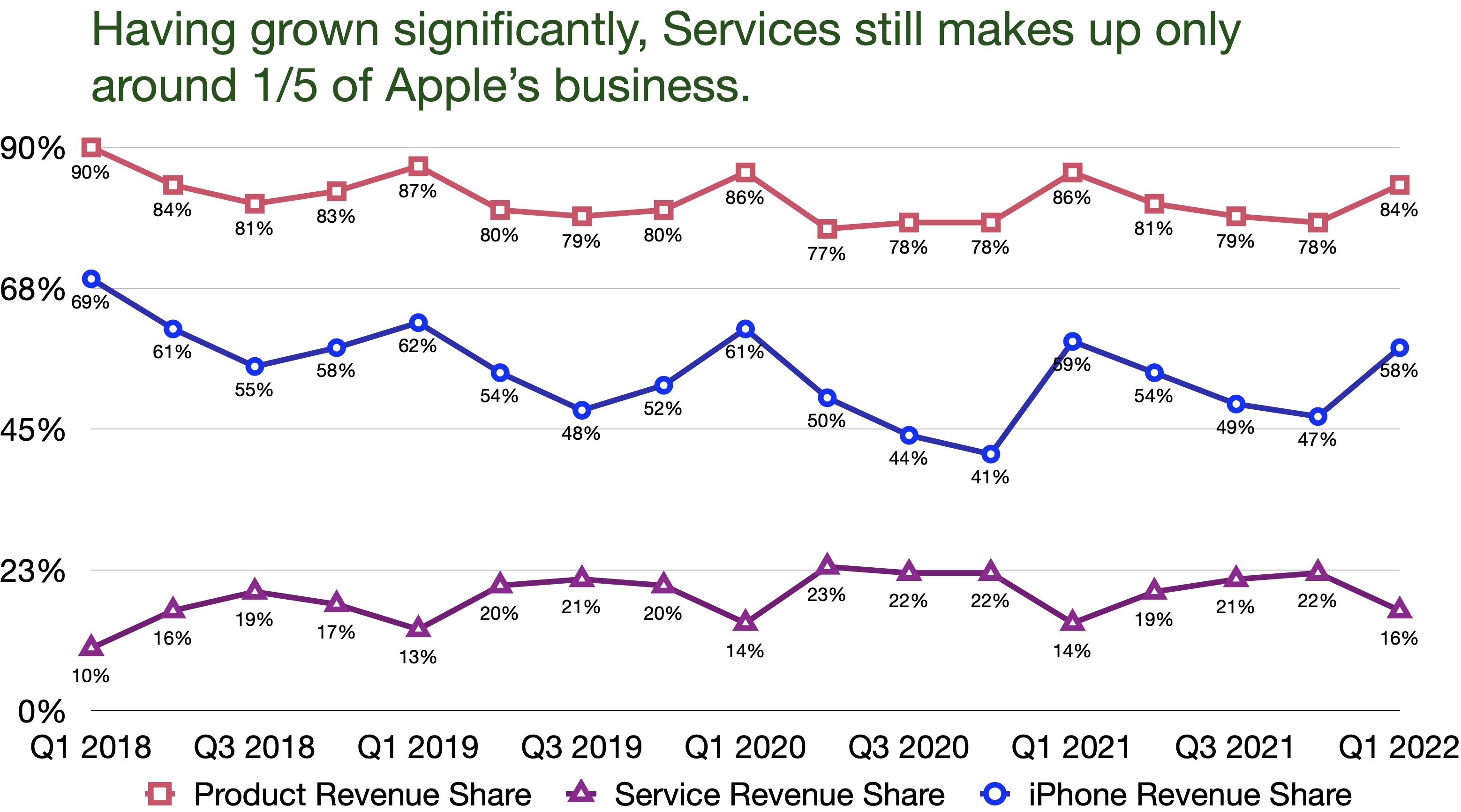
Services has got a lot of attention due to its explosive growth, but Product and iPhone in particular are still the main revenue drivers
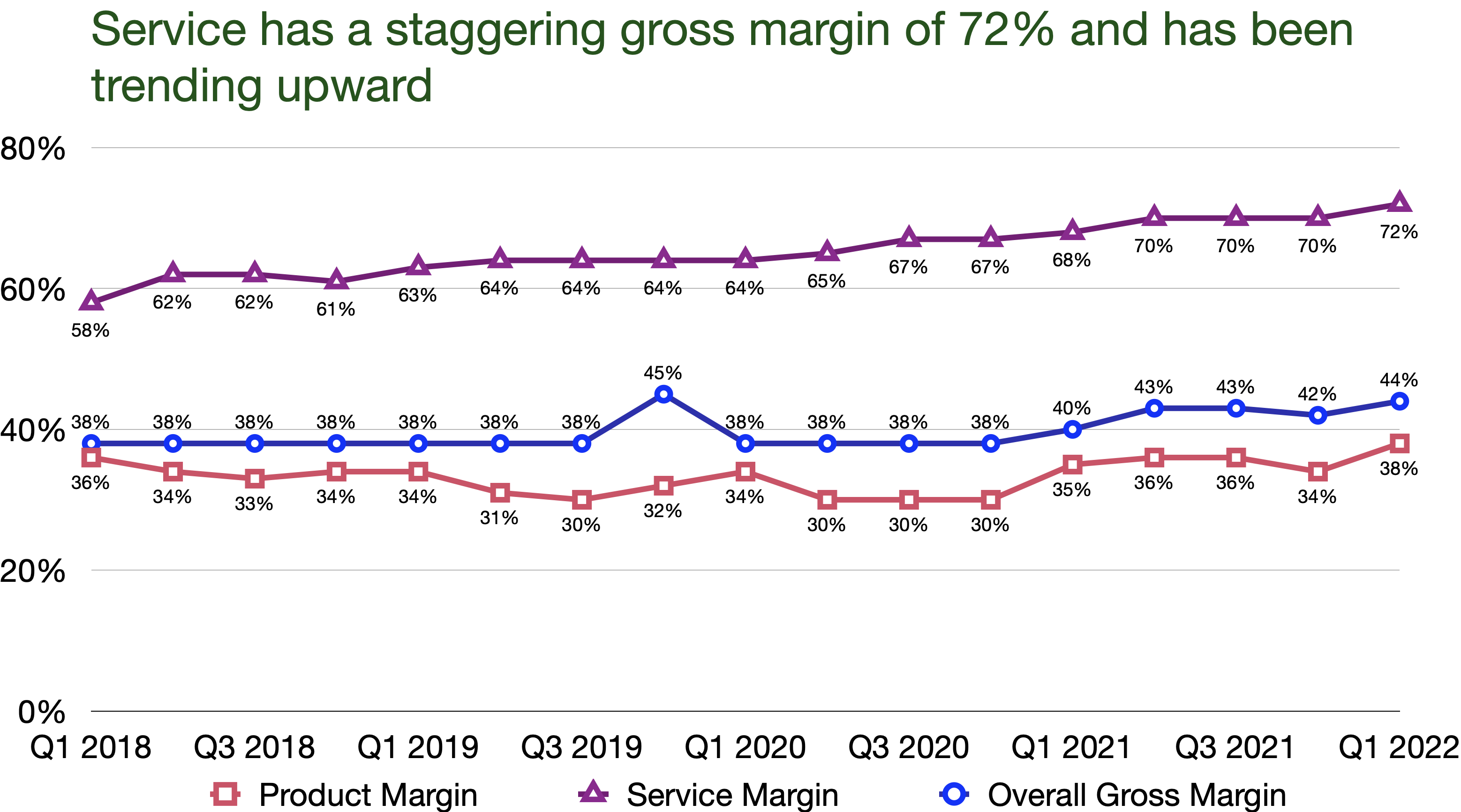
Both Product and Services’ gross margins have been increasing in the last 2 years. Services’ margin is an astonishing 72%
Wearables is now Apple’s 3rd biggest business
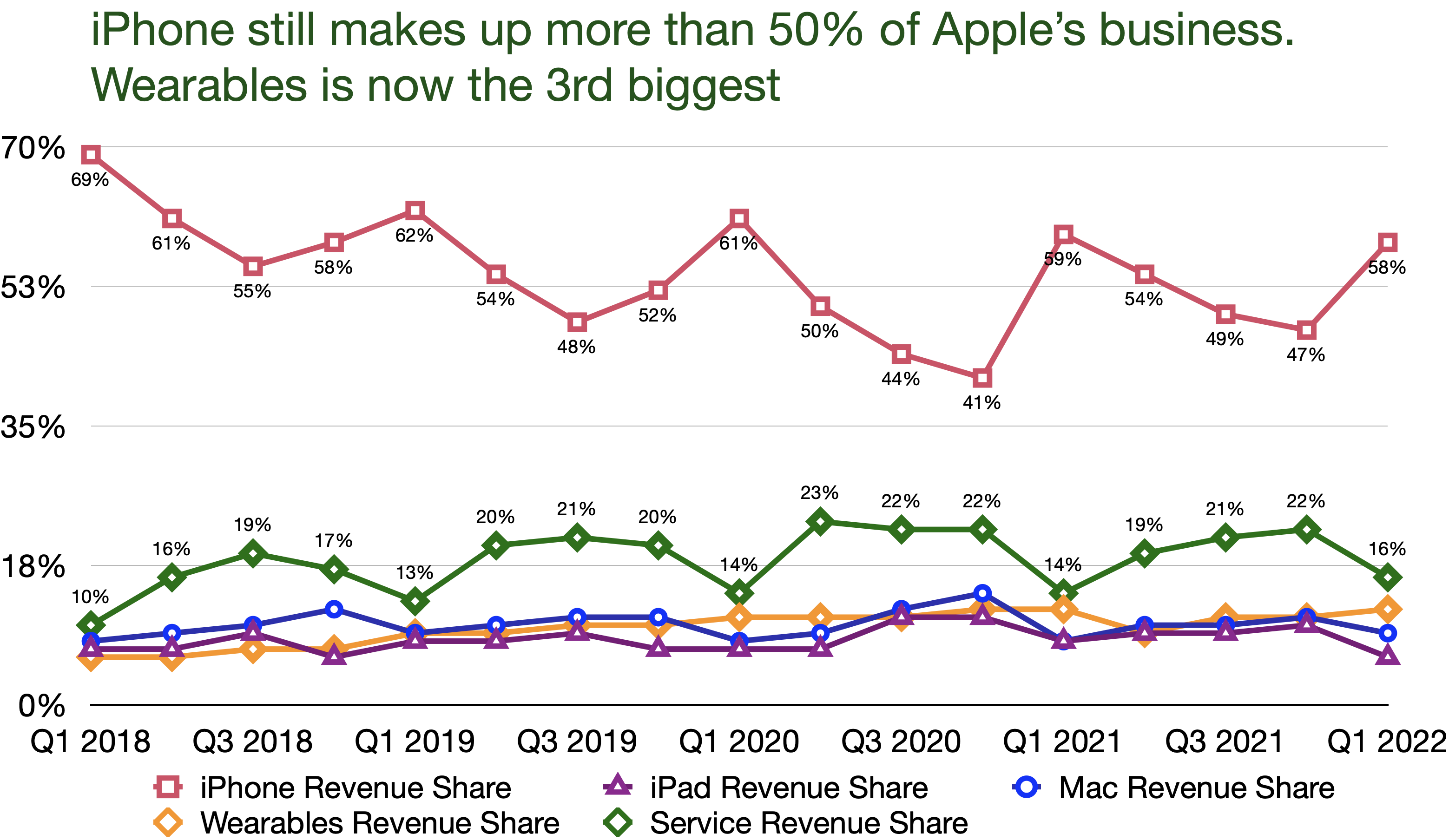
Wearables and Services have grown every quarter YoY since 2018

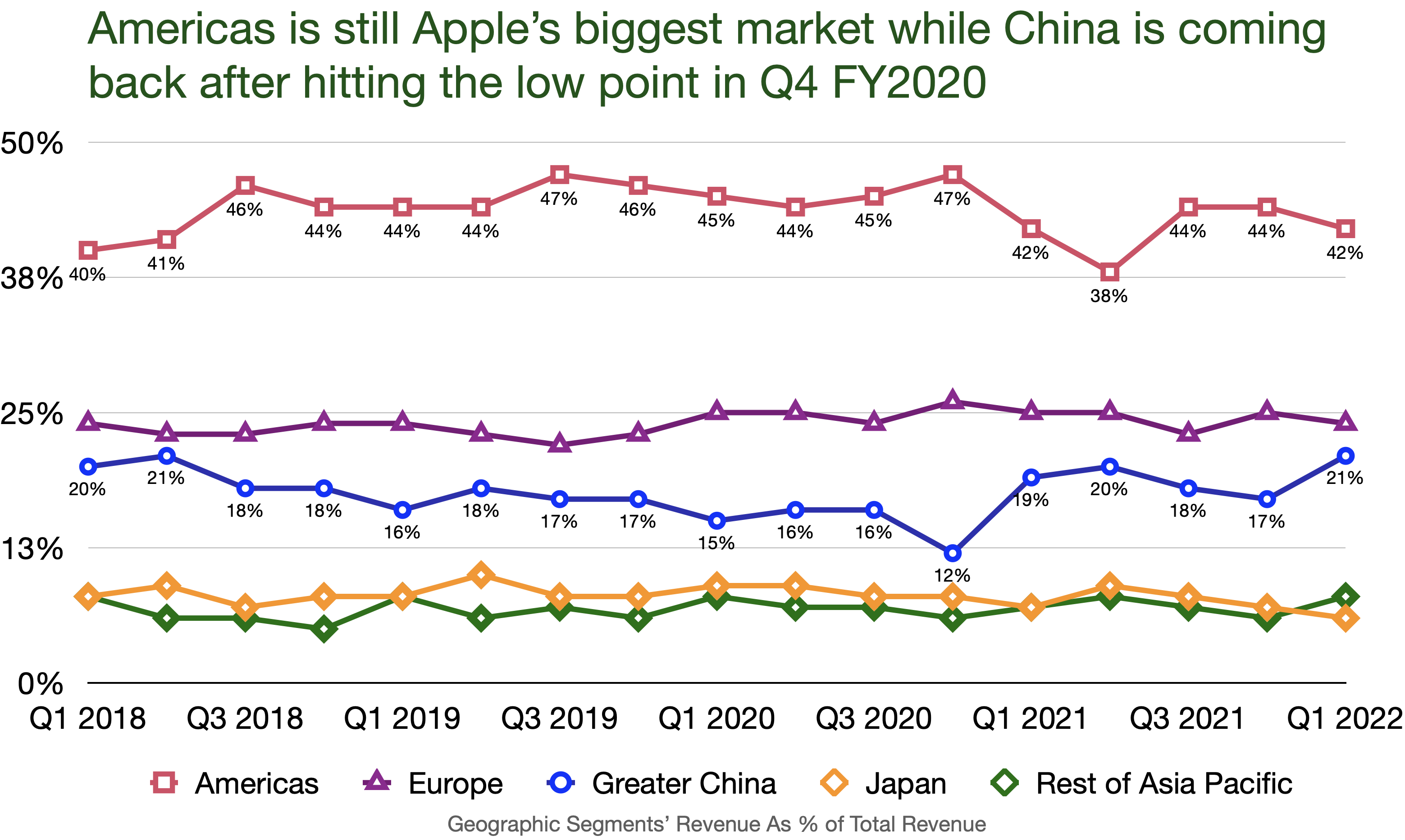
Apple is back in China
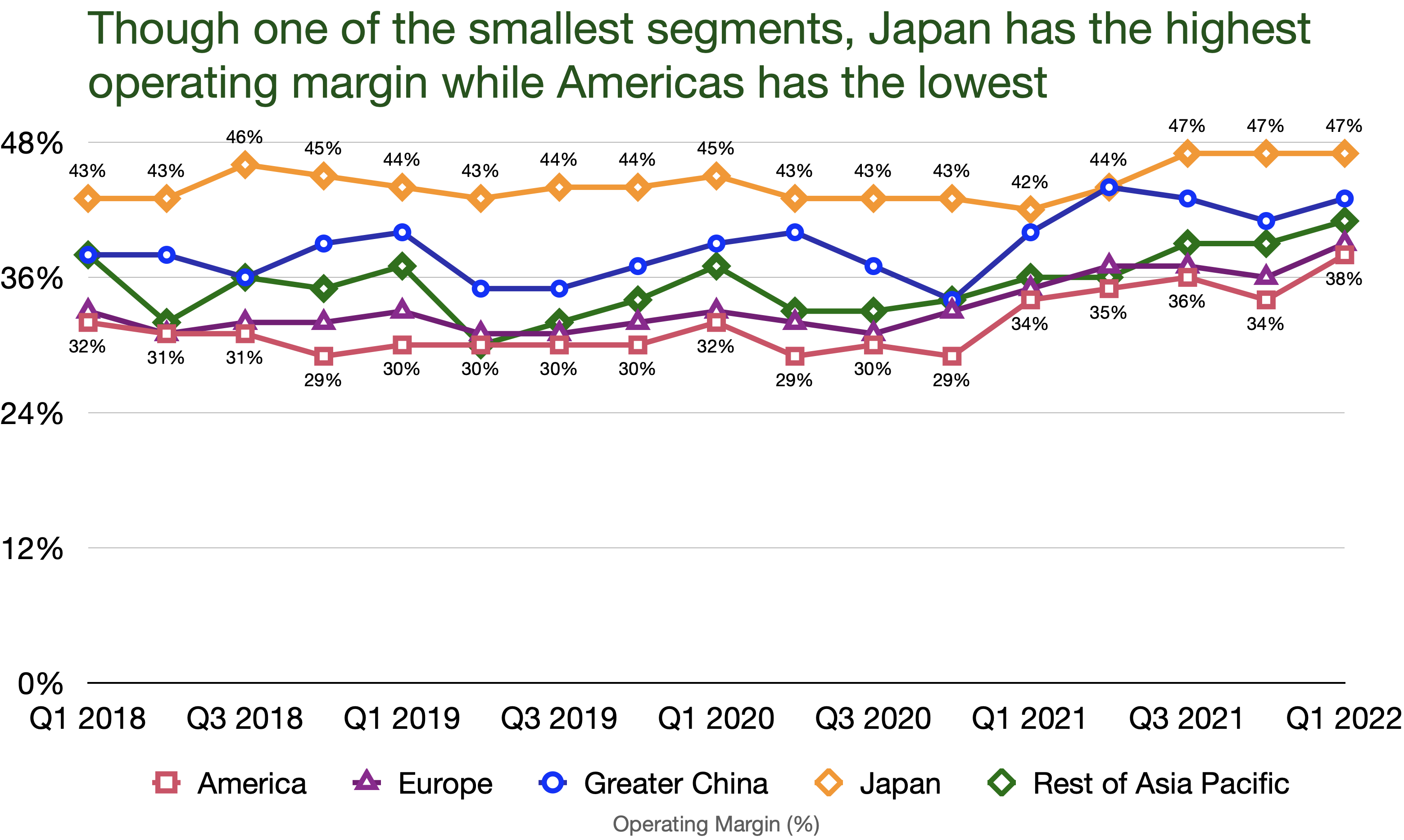
Japan, Apple’s smallest geographic segment, has an astounding operating margin of 47%
Apple’s users are increasingly engaged within the ecosystem
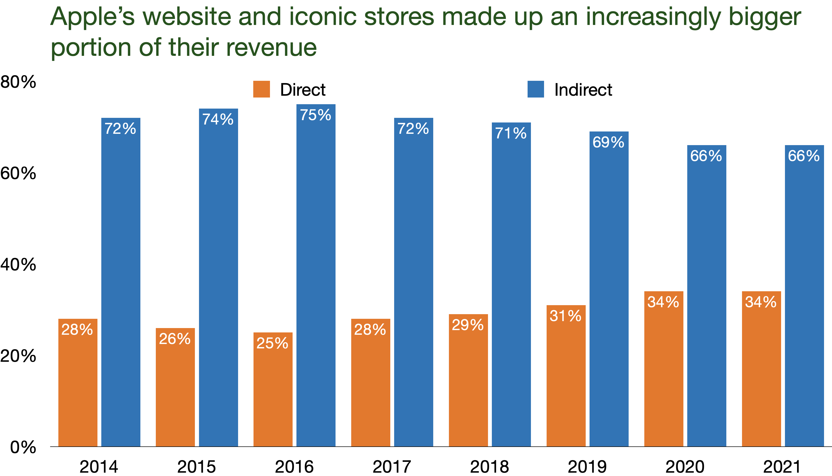
Direct channels have made up 1/3 of Apple’s business in the last three years
Disclaimer: I own Apple stocks in my portfolio

Leave a comment